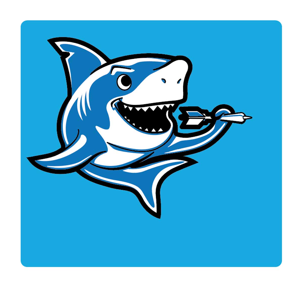
Concept: The Shark character logo design required creating a unique shark logo. The customer a UK-based retail entertainment business, that was introducing an indoor sports concept. The client wanted a logo that captures the shark’s essence while maintaining a friendly, approachable demeanour, avoiding an overly menacing appearance or the softness of a dolphin. No small feet in itself. After multiple visuals and revisions on three initial compositions, the shark character took shape.
Styling: The logo needed to be simple, clean, and versatile. Given its use across various branding elements such as packaging and signage, the design was required to maintain its integrity in both standard and reversed-out colour-ways (white on a dark background). Special attention was given to ensure the logo functioned consistently in both settings without altering its core style.
Notes: The artwork was created using Adobe Illustrator, with all elements strategically separated on different layers. This setup ensures flexibility for future projects and ease of modification during production or branding updates.
More examples click here, or if you would like to see the whole portfolio, click here.
Need more information? Call Adrian UK 07803 126079