Description:
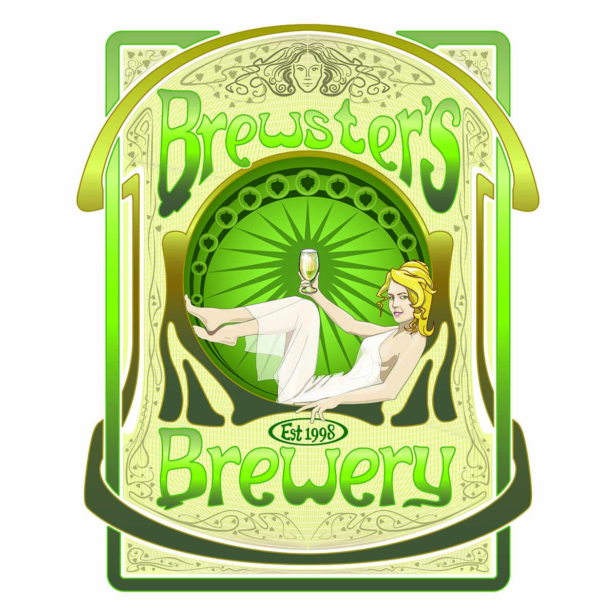
This Art Nouveau styled illustration was commissioned by a nationally recognised brewery in the UK. It is currently being used for the company branding on letterheads and was modified for pump clips. Graphic illustrator skills were employed to great effect, and paid dividends later on when it came to modifications and updates. The Art Nouveau branding was carried through the company, but this graphic logo was at the hub of the company brand.
Concept:
The client wanted an Art Nouveau themed logo and branding. The concept was conceived following a detailed meeting with the client, and after some interesting research. It was agreed a modern day interpretation of French and Flemish Art Nouveau was the theme. The brand logo had to follow the stylish look, but also have a clear identity.
Styling:
The Art Nouveau movement was the inspiration for this illustration. So colours similar to the art movement were used, as well as sympathetic line work. The whole illustration was produce using Adobe illustrator following pencil sketches. The logo was updated in 2016, where a new boarder was developed, and the glass in her hand was change. This update involved extensive graphical illustration work to the boarder where it was enlarged and extended in all directions. The Art Nouveau woman had her hand changed to hold the glass a different way following comments that she held it in a manly way.
Notes:
If you’re looking to commission a graphic illustrator to help you, please feel free to get in touch. Or you might want to see other examples of graphic art? Then click here to see more.

