About this blog.
This blog is about freelance illustrator Adrian Cartwright, and how he takes on a commission from Creative director David Hodgkins. And producing hyper realistic illustrations for packaging and its process. Looking at the illustration development, reviewing techniques and the challenges over a 7 year period. Drawing from planet illustrations many years experience producing technical illustrations. And research into human behaviour and understanding of graphical instructions. Looking into how collaborative work with the creative director, and the graphic design helps to develop a powerful and enduring illustration.
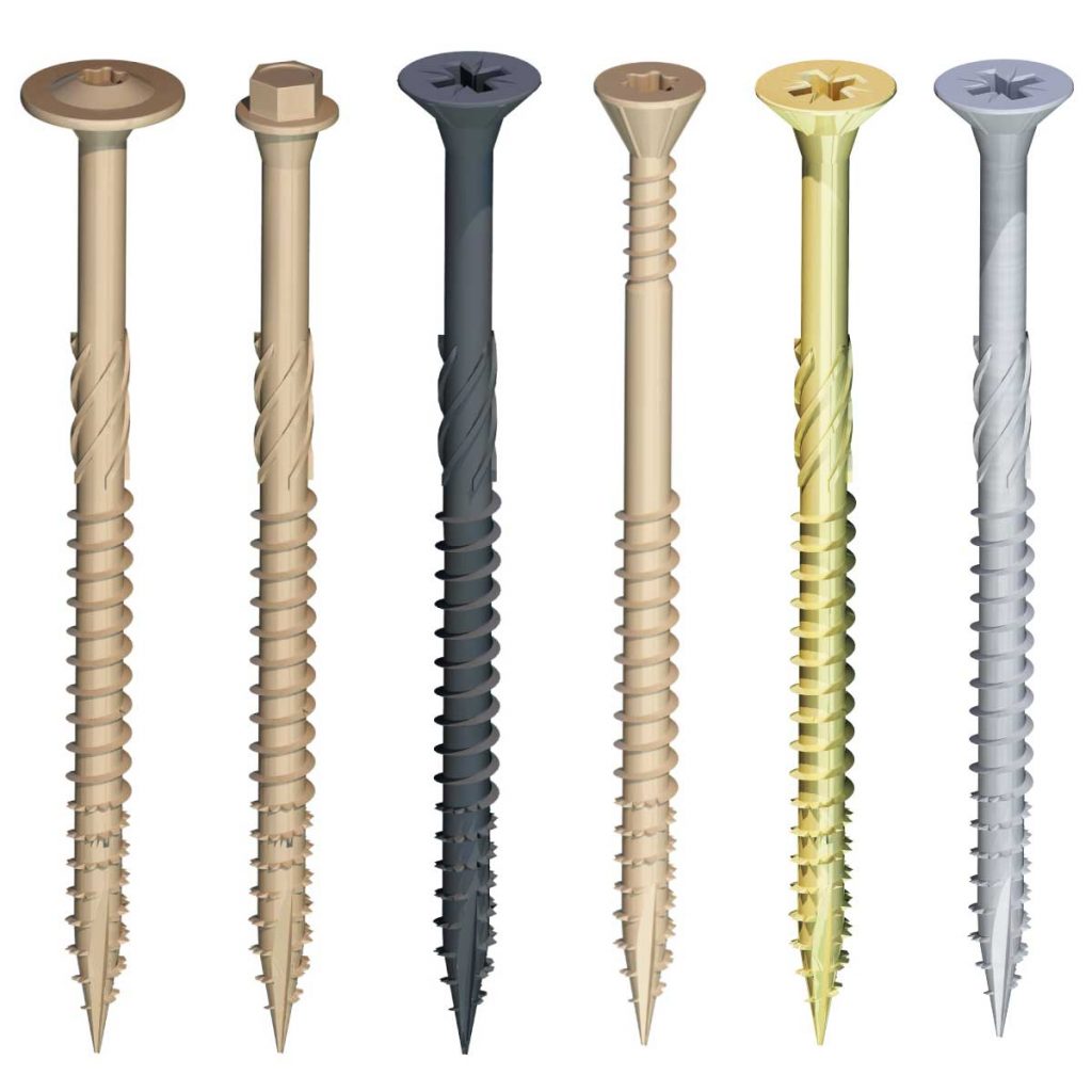
We start with the first commission and work our way through the 7 years to present day, noting changes in customer perceptions and design. The illustration were used to promote the screws through marketing at trade shows, advertising and package design.
About the Project.
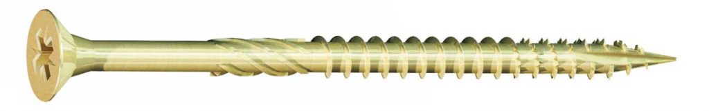
Originally commissioned back in early 2016, the illustrations of what is quite a sophisticated screw has been a progression of design and illustration development over the last 7 years.
We see it here in its latest form for the new 2023 packaging, but let’s get back to the beginning.
How it Started.
The commission started in April 2016, when David Hodgkins creative director at Mint Creative contacted planet illustration. I was at the time working from my illustration studio FGS located in Derby city centre.
After a telephone conversation, where David explained his ideas, and the challenges to consider, we decided to produce just one from the set of 3 illustrations needed, to see how the process went.
The client was keen for the illustrations to be similar in style to a competitors because their existing packaging looked outdated and low budget.
Now I understand when a customer shows me a competitors product, and that they feel behind in some way. But I often wonder why they only ever want to look as good as the competition, and not better. Perhaps they simply see something that works, and don’t want to take a chance paying more for something that might not work.
So with some initial direction from the client, different ways to produce the illustrations was discussed, and David kindly gave me the freedom to see how a 3d model rendition went, but we did also consider creating the illustration firstly in Adobe illustrator and depending on the styling, then possibly finished the illustrations in Photoshop. The competitors screw illustrations were clearly Heavily Photoshopped photos of the products.
First rendition of the Screw…
3x screw illustrations were produced using SketchUp for the modelling and then rendered in a 3rd party rendering software. This is where I started to realise how important photography skills were when illustrating with CAD especially when a photo realistic style was needed. Consideration for not just lighting, but colour, and their behaviour with multiple lighting sources. I also learnt a lot about reflection, especially with metallic textures.
Tweaking and Blending.
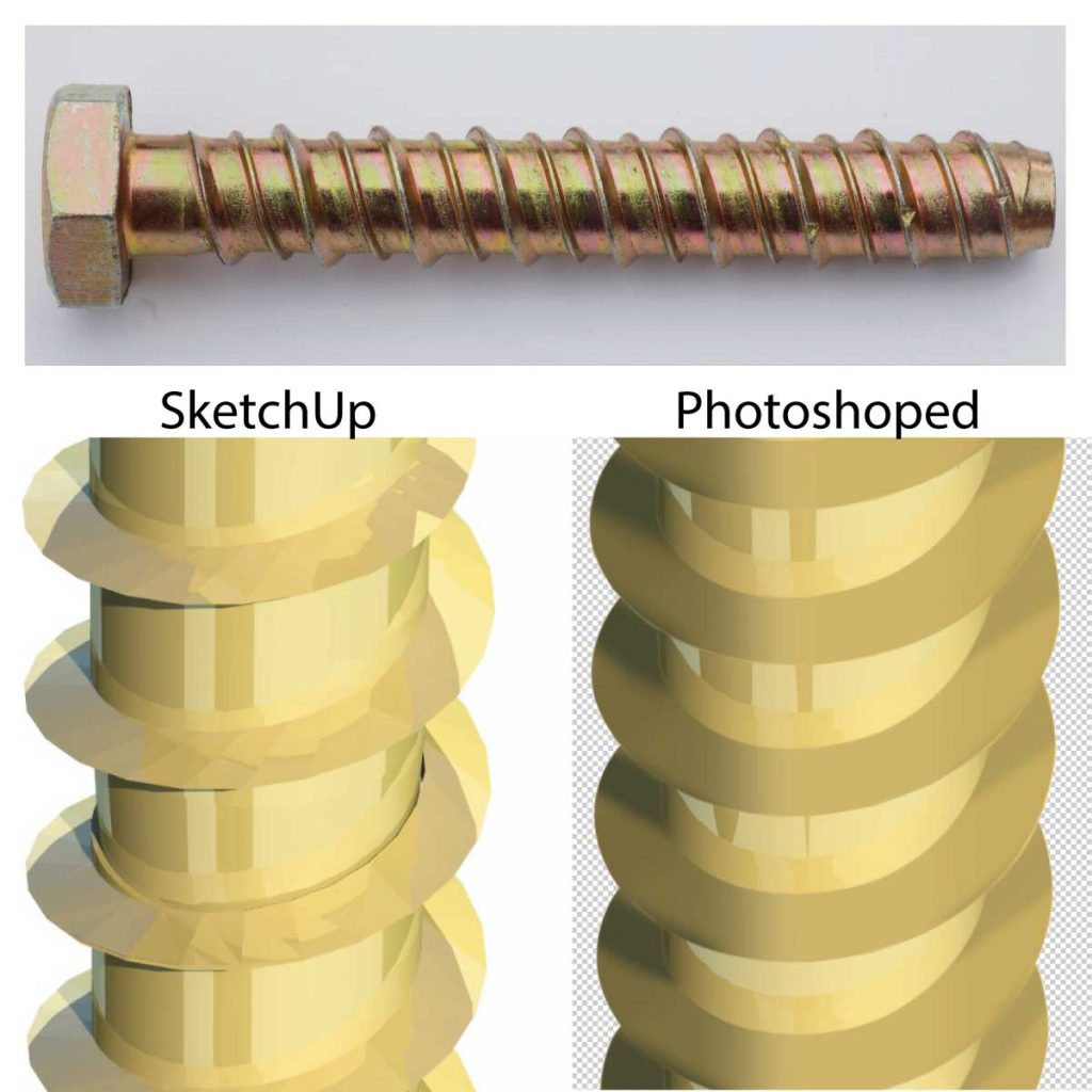
“repair work” I liked to call it with the models. This is due to the differences of exactness of digital modelling, and the real world where products aren’t made digitally. A typical example would be where the wedge (the spiral on the shaft of the screw) meets the shaft. It’s not a very hard corner, but more of a blend to another direction. This is a small detail that’s often un-noticed, but when you ignore it, it looks wrong and sharp. So some modelling and photoshop was use to make the screw look real and from one piece of material.
Additional illustration.
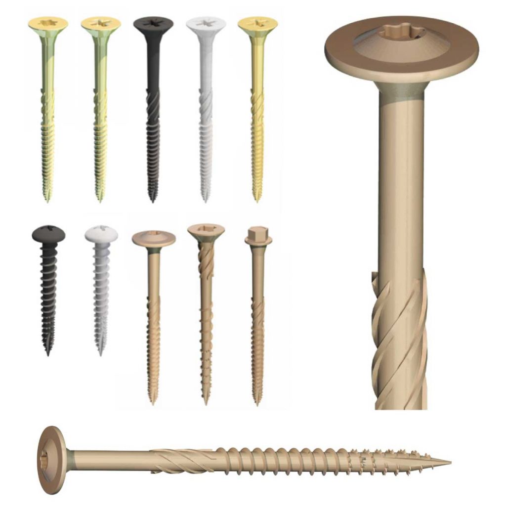
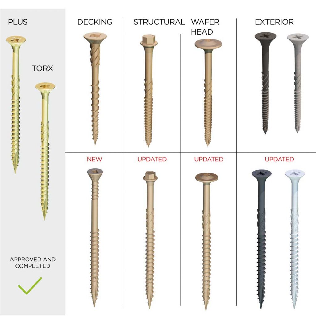
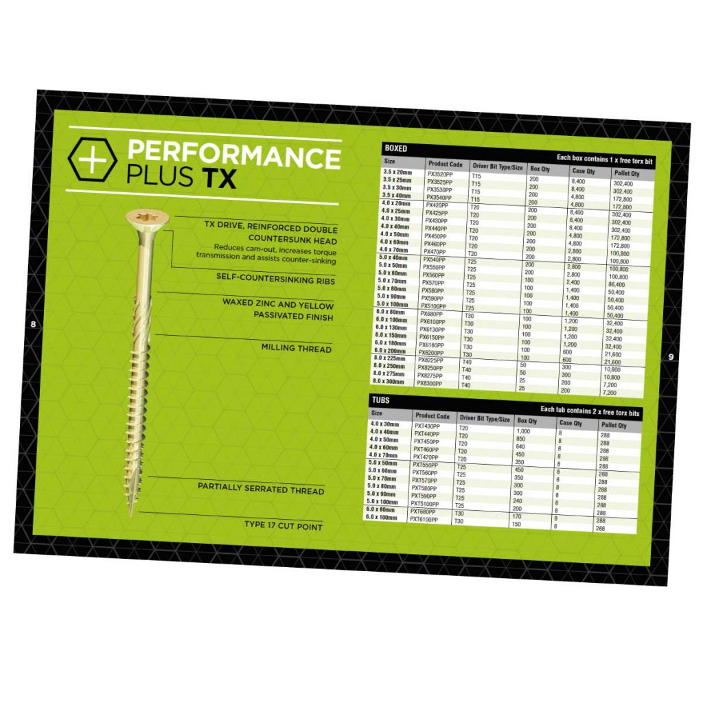
In 2017 an additional illustration was commissioned to compliment the existing images. Performance Plus was an update on an existing screw with a different interface ( head ) for the Torx type of fitment. Torx head screws resist “cam-out” better than a “philips” head. Something I didn’t know about, but it’s a common problem when screwing, especially when you use a power tool, where the tool isn’t in properly and can flick itself out.
Later on in 2017 an additional screw head was commissioned and. Based on the Torx but with a wider head, often preferable in softer materials. This involved a reconstruction of the main shaft and new head design. The head was a complex part of the illustration, but its symmetry was an easier challenge than the screws wedges on the shaft.
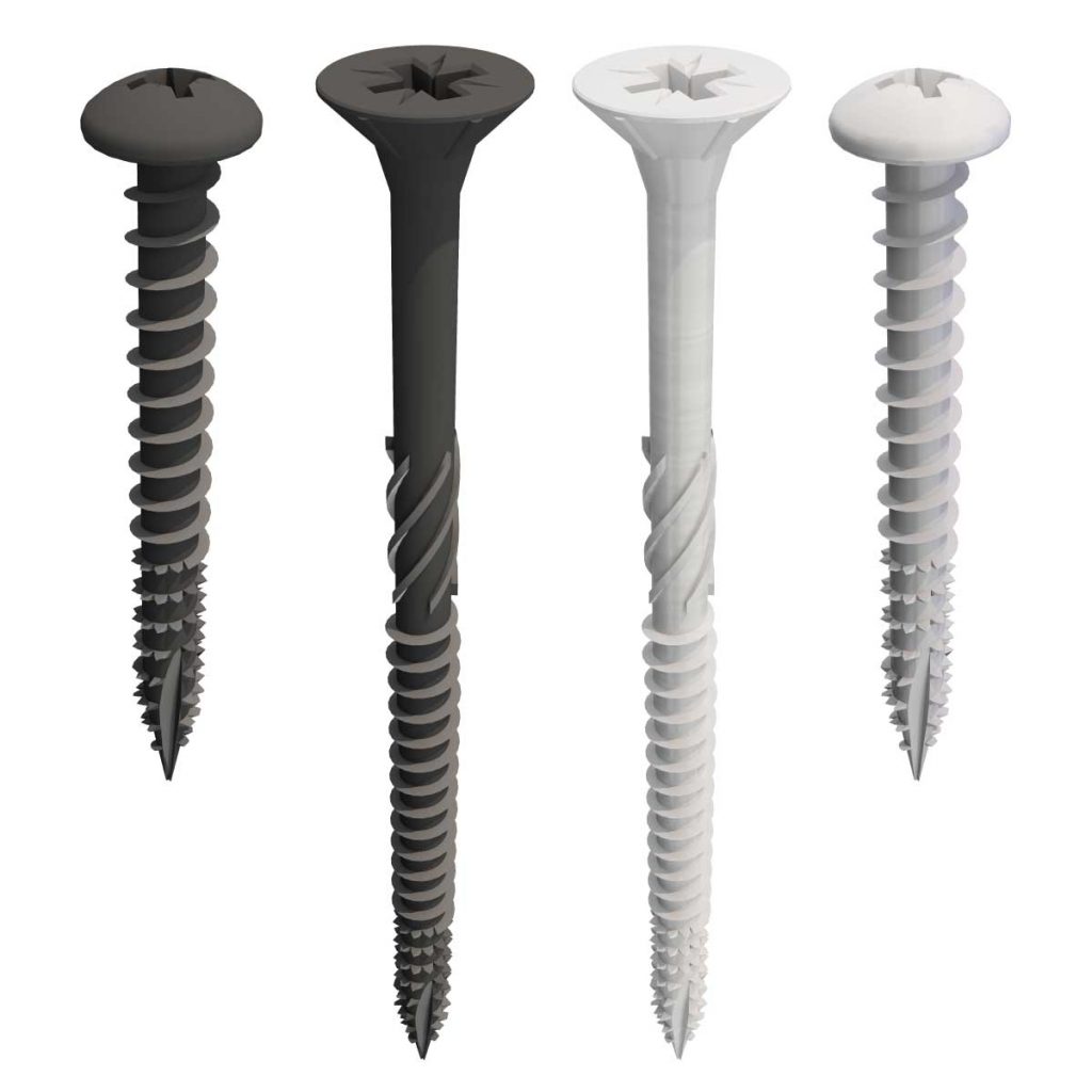
New Colours.
Late 2020 brought another update, this time a completely new screw and two new finishes. The textures were less reflective but simple to produce. The new screw was a success too, learning from the previous screws, I designed a more stable model, with cleaner edges.
However due to the textures less reflective appearance, I had to do extra work on the threads in photoshop to create a good contrast and definition. After all, the illustrations are to promote the product and give clear definition of it. Again, photography knowledge was very helpful and needed with this rendition.
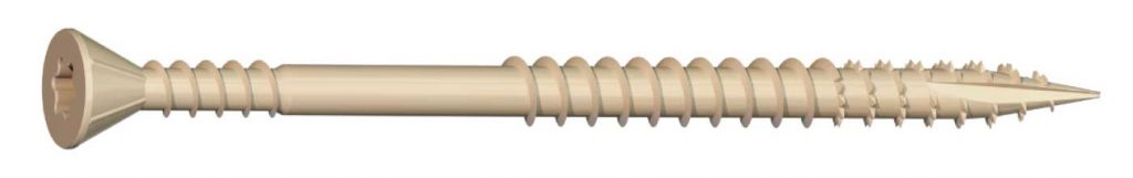
A New Way to Look at them.
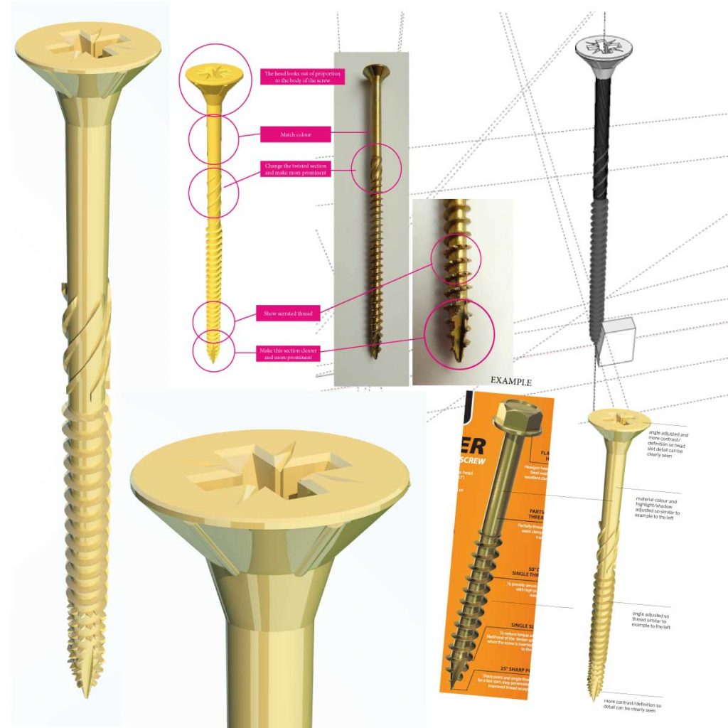
2022 Brought in a new way of looking at the screws. The client had updated their ideas of the perspective of the screws, wanting a more side on view. Giving a better representation of the screws length and helped to highlight the special features, especially at the tip ( pointy end ).
Up until now the perspective of all the screws had been based on the original and approved composition. A change to make the screw more proportioned to the actual product clearly highlighted that the buyer of the product was looking at, which was the illustration on the packaging. They were looking at the illustrations for the features they wanted, and not always reading the products features. This often happens, where a picture can confirm a particular thing within a moment. Far faster and multi-lingual than reading text on the packaging.
I had my Concerns.
At first I had my concerns making the perspective so side-on,. It would minimise the wedge profile, and you wouldn’t see the head’s interface !
Then I realised if I changed the field of view, the angle could still show the head interface detail, and also the thread of the screw. But because the field of view was so low, there would be little foreshortening and distortion of the shaft. Like isometric perspective I guess. This kept the dimensions similar to the real thing, but also provided the pictorial features needed for quick visual recognition.
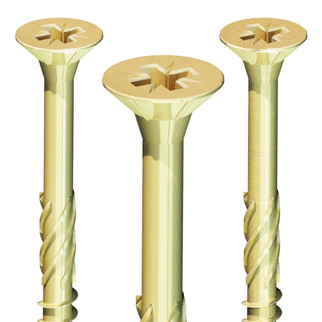
Improvements to the Texture and Colour.
That was only half of it. The creative director felt that the colour and texture of the screw could be improved. This brought its own challenges.
Screws were sent to me in the post, similar to the original commission. New textures were created using photoshop, and tested with the models to get a reflective and textured finish. Quite a lot of work with bump texture and refractions was done, and along with some photoshop post model stage, we got it. That was just the one screw, there were others to come.
New Screws.
Late 2022 commission was for a completely new decking screw and 4 existing screw illustrations to be updated to follow the new perspective within the new branding and packaging.
The screw illustrations are an example of nearly 50% of my customers, who come back to me over the years to update or team up on new projects. If you’re looking for an illustrator who can work with you and develop your product over time… give me a call, it’s kinda my thing. Contact me
More…
Read more blogs here and if you’re interested to see more of what I do, click here.